
New Perspective Maps- What They Didn't Show You in Geography Class


Maps really open our eyes up to new perspectives on the world around us. Some show us how big countries and continents actually are, others show us the reality of crime in our own neighborhoods. These maps are the ones you never learned about in your high school geography class! We’re betting you’ll see the world a bit differently after seeing these…
Who Every State Hates
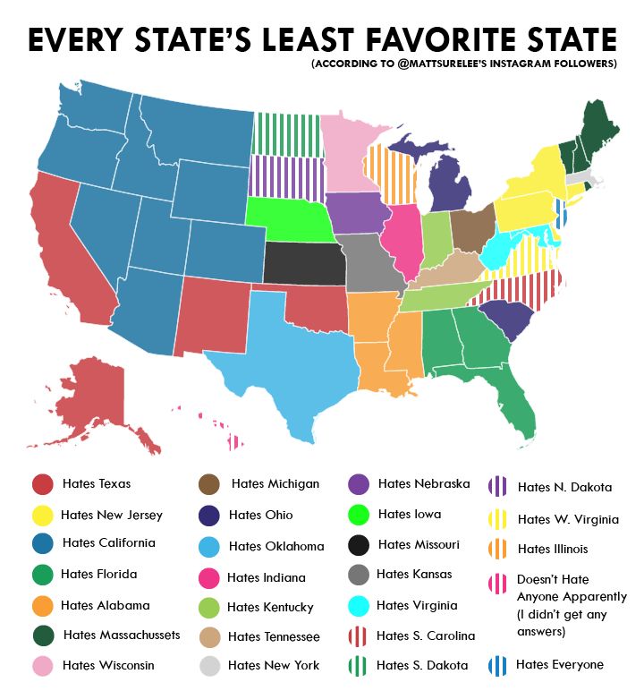
According to this Instagram user’s followers, each state in America has another state they can’t stand – unless you’re in New Jersey, in which you apparently hate everyone equally, or Hawaii, who apparently hates no one. Poor California just can’t catch a break here!
Land Use Throughout the Nation
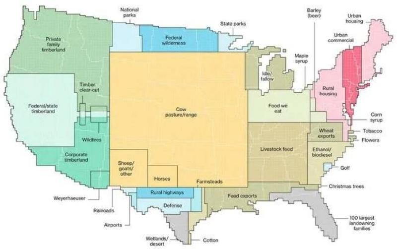
This map shows us what each area of the United States is used for, land-wise. As you can see, a large percentage of the country is dedicated to either livestock, or something pertaining to livestock (such as their food). Other industries include timber, urban housing, and Federal wilderness.
America's Population Density
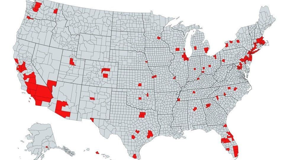
All together, the red areas on this map have a larger population than all of the gray area put together. It’s pretty clear that Americans tend to flock to the coasts!
DEA's Map of Cartel Influence in The United States
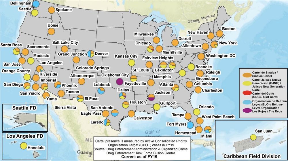
The U.S. DEA released its annual National Drug Threat Assessment, mapping out the states that Mexican drug cartels have infiltrated. The report says various cartels maintain great influence in most US states, with the Sinaloa Cartel and Cartel Jalisco Nueva Generacion showing the strongest footholds. This map shows the Sinaloa Cartel, Cartel Jalisco Nueva Generacion, Cartel del Golfo, Organización de Beltran-Leyva, and Los Rojos, all with a presence in Texas, California, Arizona, New Mexico, Chicago, New York, Florida, Kansas, Colorado, Hawaii and Puerto Rico, among other states.
Light Pollution
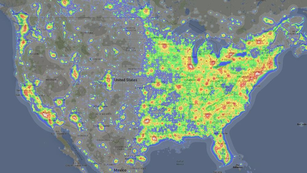
This map shows us which parts of the United States have the most light pollution, so if you consider yourself a stargazer hobbyist, it may be best to avoid the East Coast – or really, the entire eastern half of the United States for that matter.
Noise Pollution
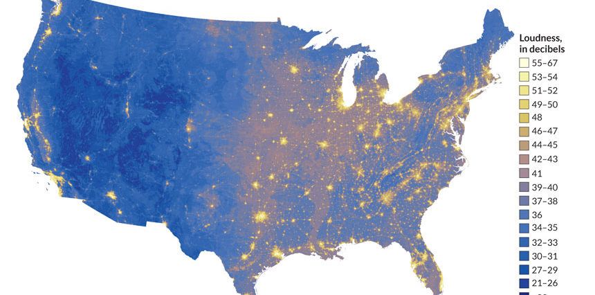
Apparently the eastern half of the United States isn’t just brighter, it’s also noisier. Moral of the story, if you hate people, steer clear of the eastern half of the country and large cities in general.
Places Mentioned in the Bible
This map is for any Biblical scholars out there. Considering travel was much more difficult back then than it is today, it’s pretty fascinating to see how much knowledge people had of other parts of the world at the time that the New Testament was written in the first century AD!
The Closest Country to Each Part of the US
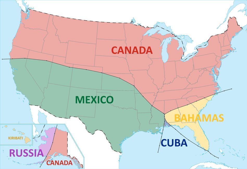
The sections of the US that are closest to Canada and Mexico are pretty obvious, but how weird is it that some parts are closer to Kiribati, the Bahamas, Cuba, and Russia? Just goes to show how big the US really is!
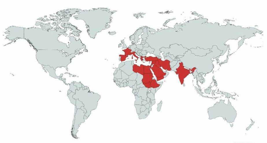
Metric vs. Imperial
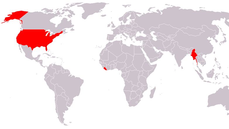
We’re all aware of how little the imperial system of measurement is used throughout the world, but this map really puts it into perspective. The only countries that currently use it are the United States, Liberia, and Myanmar. But at the end of the day, we can all thank the British for that, because they brought it over with them a couple hundred years ago when they colonized America. Thanks, Brits.
Middle America's Population
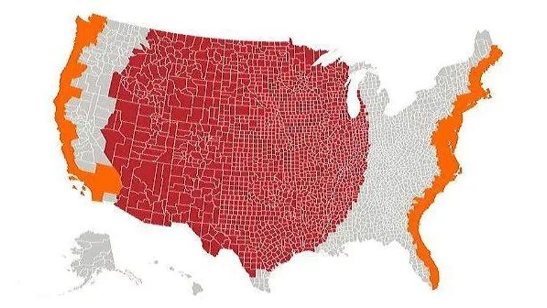
As we saw before, it’s no secret that Americans tend to flock to the coasts, but this map puts it even more into perspective. The orange sections represent a population equal to the entire red section. If you like nature and being away from other people, the red section (AKA the flyover states, or middle America) might be for you!
Abandoned Railroads in America
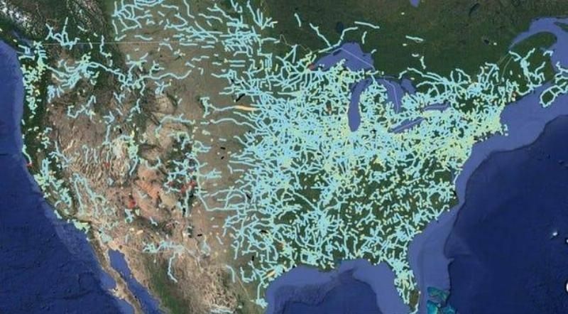
The invention of the railroad in 1827 was huge for transportation. As you can see, most of the abandoned railroads are in the eastern half of the country, which makes sense when you consider that the country slowly expanded into the western half in the 1800s. As planes and automobiles gained popularity, the train became less popular, and more railroads were abandoned.
Snow Cancellations
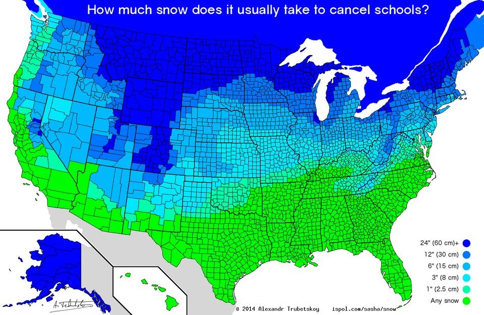
Depending on where you grew up in the States, snow was either really cool, or a huge drag. In states with harsher winters, it was pretty much guaranteed that you were going to be required to get to school on time, even when it snowed a foot the previous night. But if you grew up a bit further south, even a light dusting was enough to get you out of school for the whole day!
Preferred Coffee Chains
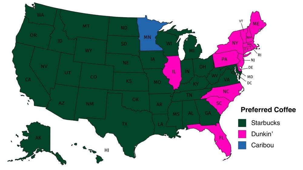
Dunkin’ Donuts’ motto is “America runs on Dunkin’” but that’s apparently not entirely true according to this map of Americans’ preferred coffee chains. In fact, the majority of Americans prefer Starbucks. And then there’s Minnesotans, who prefer Caribou, whatever that is.
Places Johnny Cash Has Been in 'I've Been Everywhere'
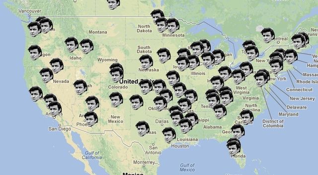
In the song “I’ve Been Everywhere,” Johnny Cash claims that he has, in fact, been to a lot of places, and this map shows all the places he mentions.
All of the Countries That Can Fit Inside the US
The US really is massive, and this map shows all of the countries area-wise that would be able to fit inside of it, with a little room left to spare even. It’s a lot, as you can see.
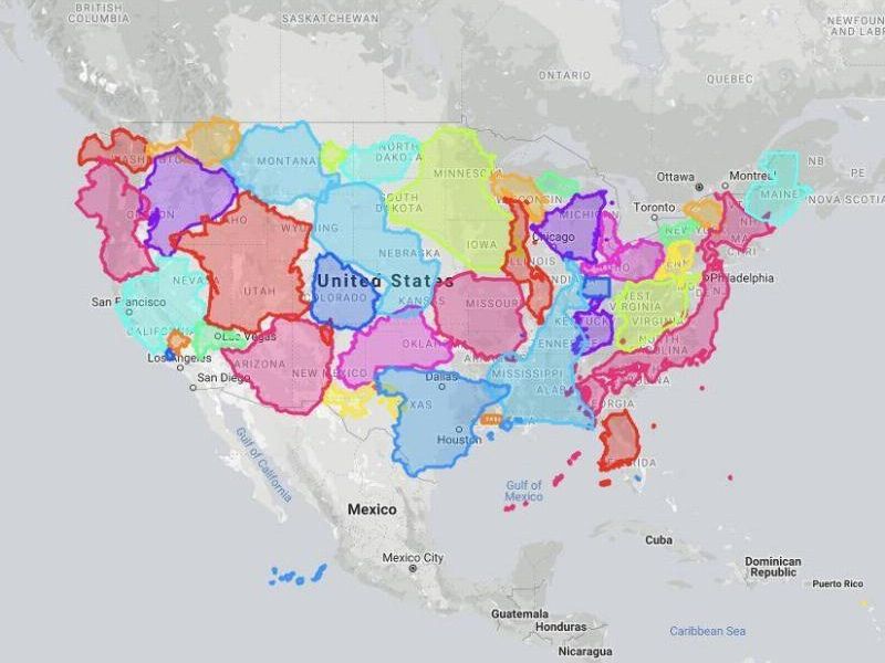
Route to all of the Springfields
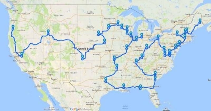
The US has a LOT of Springfields – 33 to be exact, and Wisconsin alone has five of them! And that’s not even including the townships (in which case, there are 36). If you’ve ever desired traveling to all of them in one trip, then this is the map for you! It shows you the most efficient route.
The True Size of Greenland
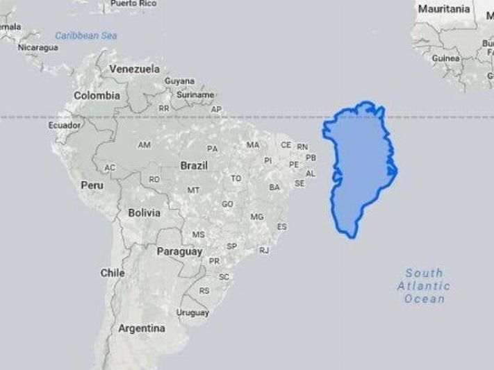
From maps like the standard one you just saw, we tend to get the impression that Greenland is absolutely enormous – we’re talking the size of the entire continent of South America enormous. In reality, however, Greenland is even smaller than Brazil, area-wise. As a contrast, it’s interesting to note that the entire island of Greenland has a population of just over 56,000, whereas São Paulo, Brazil’s largest city alone, has more than 12 million people. Just let that sink in.
France's Longest Border is Shared With Brazil
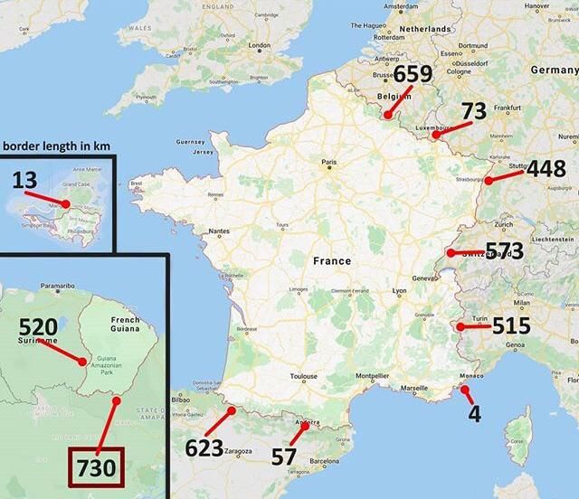
Nope, that wasn’t a typo. As you can see by this map, France shares its border with 11 other countries, most of which are in Europe proper. Its longest border is actually in French Guiana in South America, shared with Brazil.
The Range of Flamingos
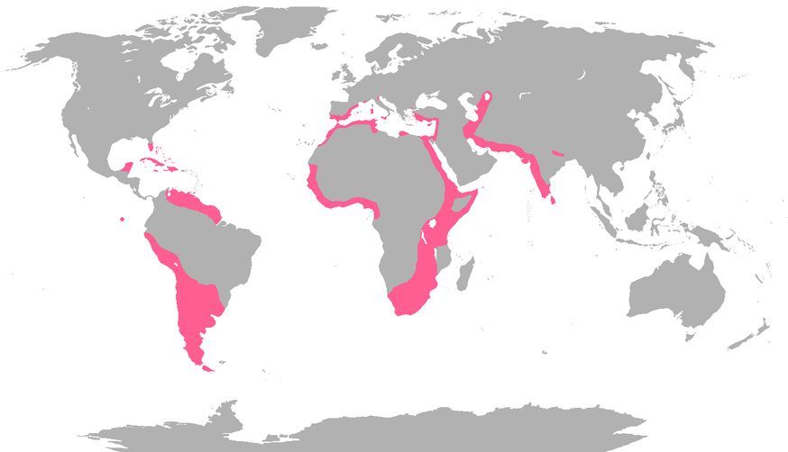
Apparently, flamingos can be found in the wild in a lot more places in the world than we thought. This is exciting news, because who doesn’t love flamingos?
An Eagle's Flight Path
This map shows an eagle’s flight path over the course of 20 years from the Middle East to Central Asia, and down through North Africa. The tracker was set up in Russia and followed the eagle until its death in Saudi Arabia. Pretty crazy that any living being could make a journey that grand in its lifetime!
Texas Isn't as Big as You Thought
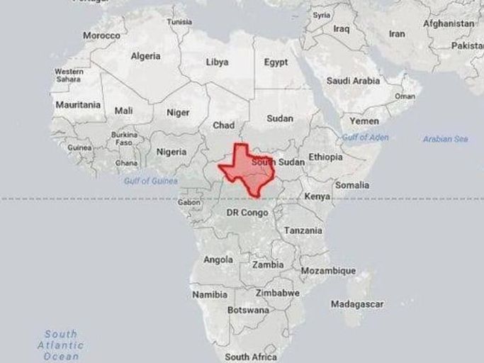
They say everything’s bigger in Texas, but apparently Texas itself isn’t as big as we usually think it is. Not when you compare it to the countries that make up Africa, anyway.
A Superhighway
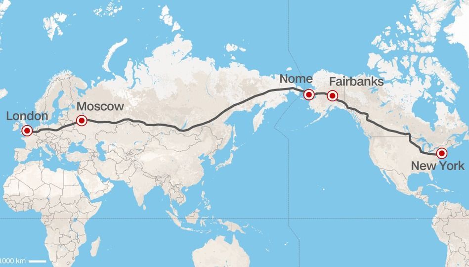
If you’ve ever dreamed of taking a grand trip from London all the way to New York City, this map is for you. It was designed by the former president of Russian Railways as one big superhighway. It’s pretty weird to think about the fact that approximately half of the trip is in Russia alone!
Map of Mars
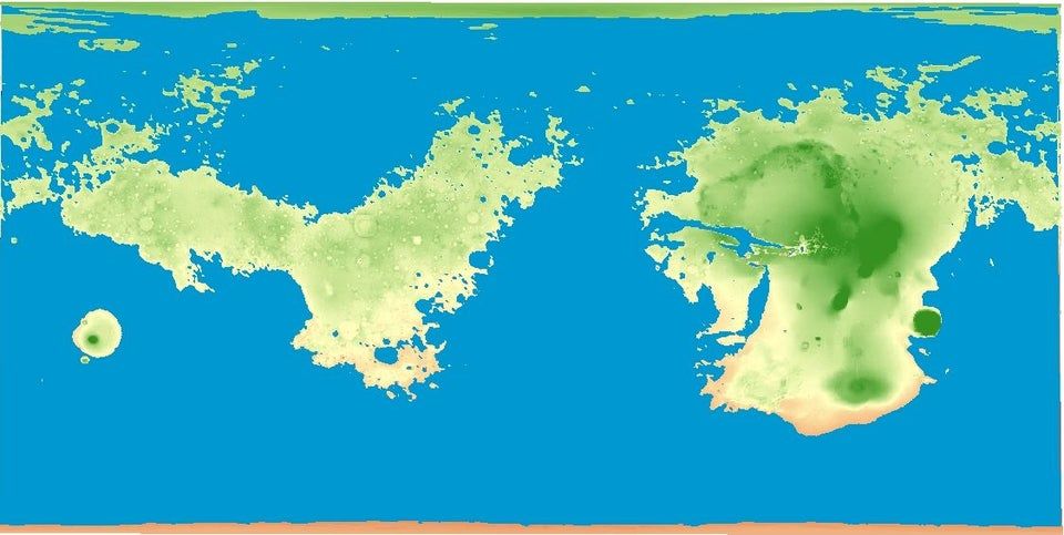
If you’re feeling a little sick of planet Earth (and let’s be honest, we all are), then this map is for you. It shows the surface of Mars if Mars was similarly covered in 71% water. Looks pretty mountainous, doesn’t it? In fact, that little island-thing on the western side of the map kind of looks like a huge volcano…
Mons Olympus
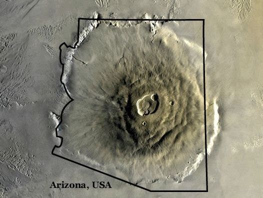
…In fact, it’s the largest volcano in our solar system, called Mons Olympus. As shown above, it’s so big that it wouldn’t fit inside the entire state of Arizona, and it’s two and a half times taller than Mount Everest. Can you even imagine what would happen if this thing were to erupt? Or maybe we don’t want to know…
The US From Alaska's Point of View
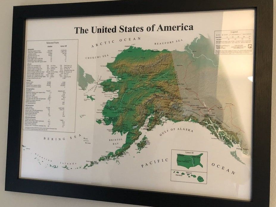
If you look at a map of the United States then you’ll certainly have noticed that Alaska always seems to be an afterthought. It’s usually printed on the side of the map, very small. Well, apparently Alaskan map makers got sick of being an afterthought, so they made their own map where mainland America is the afterthought instead!
Fires in the Amazon
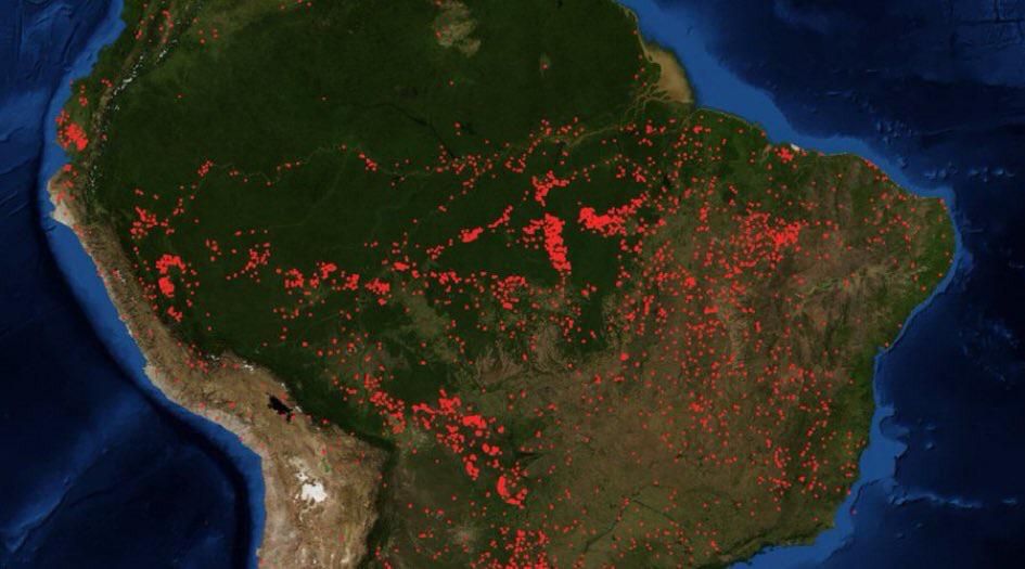
Here we have a sobering map of all of the ongoing fires in the Amazon rainforest, some of which are natural, and some started by humans. It’s depressing to see one of Earth’s wonders being continuously destroyed.
Scope of the Mongol Empire
We’re all aware that the Mongol Empire was massive, but this map shows just how massive it really was. To this day, it is considered the largest empire in the history of the world that spanned from the 13th through the 14th century. This map in particular shows the span of the empire in the year 1279. At its height, the empire held nine million square miles.
Lithuanian Magnet Map
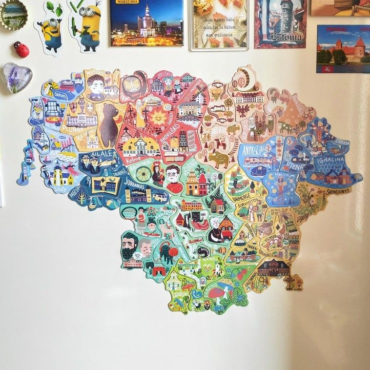
In an effort to increase tourism, Lithuania devised what is perhaps the most clever plot ever to get people to travel there- they created a map of the country made entirely out of magnets – but you can only get each magnet in specific cities. Not sure about you, but that definitely makes us want to visit. And how many people can say they’ve actually been to Lithuania? Not many, that’s for sure.
Canadians Prefer the South
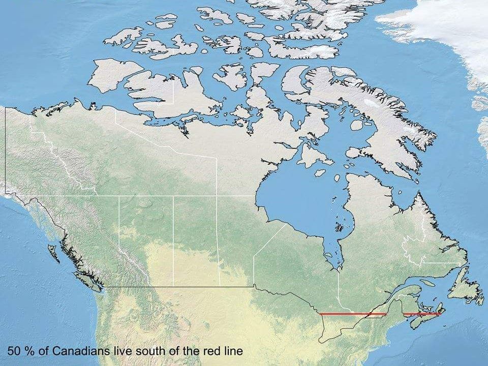
We all knew that much of Canada was fairly rural, but can you believe that 50% of all Canadians live south of the line indicated on the map? Those harsh winters up north probably deter a lot of people from living there, we’d guess!
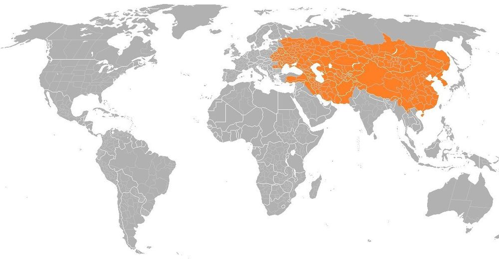
China vs. Russia
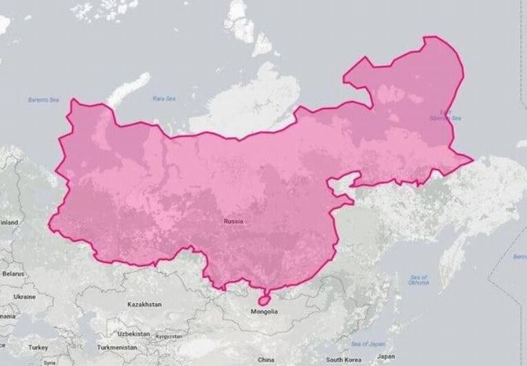
Most maps will have us believe that area-wise, China looks like a little speck of dirt compared to Russia, when in reality that isn’t exactly the case. Russia is still bigger, but China certainly gives it a run for its money.
A Standard Map
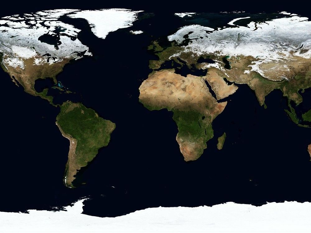
We’re all more or less used to seeing maps that look kind of like this. They may show some mountain ranges, or have the borders of each country drawn out. Just looking at this map, it’s hard to have any real perspective on anything, isn’t it?

Quick Links