
Design Fails- Photos That Prove the World Is Falling Into Ruin


Although we live in a world where designing logos and signs can be as easy as a few clicks, these design fails prove that some things are better left to professionals. But then again, in some cases, professionals must have been involved to make some of these. Surely skilled craftsmen or billboard companies proofread or double-checked their handiwork? These pictures prove that they did no such thing. Instead, they have created disasters, some of which could possibly endanger lives.
Here are some of the worst design fails you’ll ever be unlucky enough to encounter. We’re left scratching our heads in wonder at what these people must have been thinking… or not thinking! Be sure to SHARE these funny mishaps with your friends on Facebook!
'Anna's Food Food Mart Mart. Food Mart'
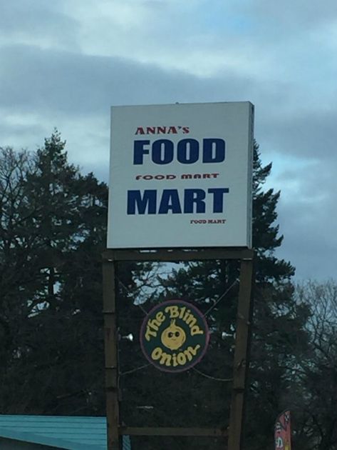
It looks almost as if three different people designed this sign without consulting one another. The words “Food Mart” are clearly visible from afar, so why add two more? The only person to blame is Anna, obviously.
A Poorly Placed Sign
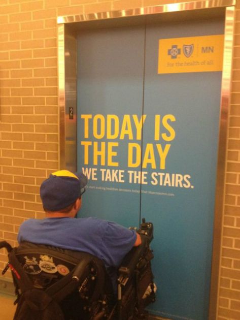
While many signs are a great idea in theory, it’s easy to forget that they may not apply to everyone. For all the people who read this and then decided to take the stairs, there was someone in a wheelchair who patiently stared at it until the doors opened.
'I'm Sure You're All Wondering Why I've Gathered You Here Today'
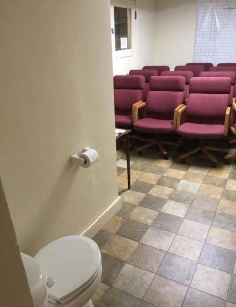
Of all the world’s strange bathrooms, this one is the strangest. Are the chairs in a waiting area? Is the toilet meant to be so confrontationally placed? And worst of all, why is the toilet paper so far away?
Keep the Hood Up
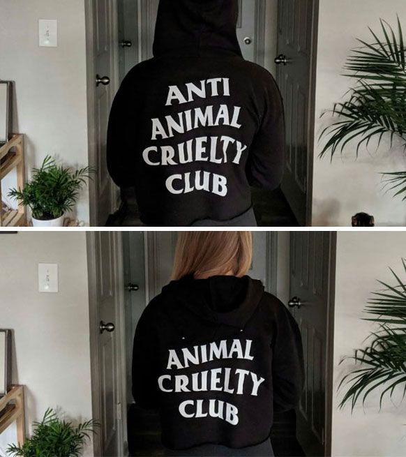
When you’re wearing the hood on this anti-animal cruelty hoodie, everything is all fine and dandy. But if you keep the hood down, you might not ever want to wear it outside.
The Single Worst Drain
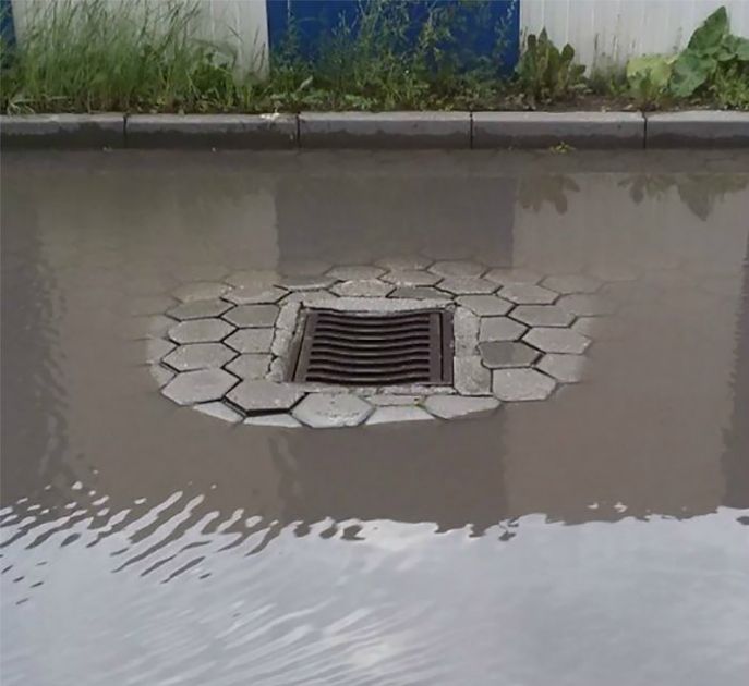
This street must remain in a permanent state of flood. The drain is somehow placed in the highest spot. It’s so poorly made it looks intentional. Why not place it at the curb, where surely it can function properly?
'This Elevator Is Out of Order!'
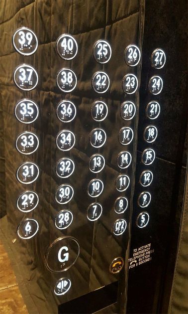
The longer you stare at this disastrous design, the more confounding it gets. There is absolutely no rhyme or reason to these numbers. Just when you think you’ve found the pattern they follow, you see the “6” in the corner. Where did that come from?
Too Many Hands
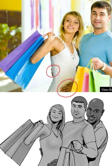
What appears to be a typical stock photo of a couple on a shopping spree turns bizarre. Why is there an extra hand on her? What’s the only possible explanation besides Photoshop? A third person, of course.
Here's My Face!
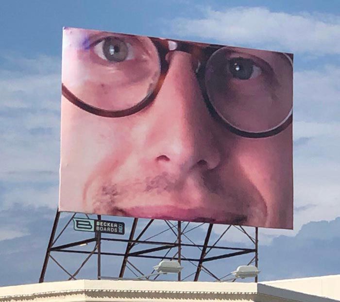
According to the original user who posted this on Reddit, he purchased billboard space to help promote his business. Unfortunately, the company “screwed up the formatting” and this was the only thing that fit on the billboard. So… they put it up anyway?
What Are You Delivering?!
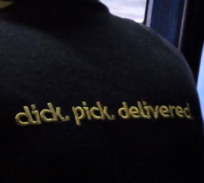
The “C” and “L” on “click” are way, waaaaaayyyy too close. How did they not notice this when they were putting the stitching in? Or maybe they did and wanted the controversy because some people just like to see the world burn.
This Watch Is Too Big
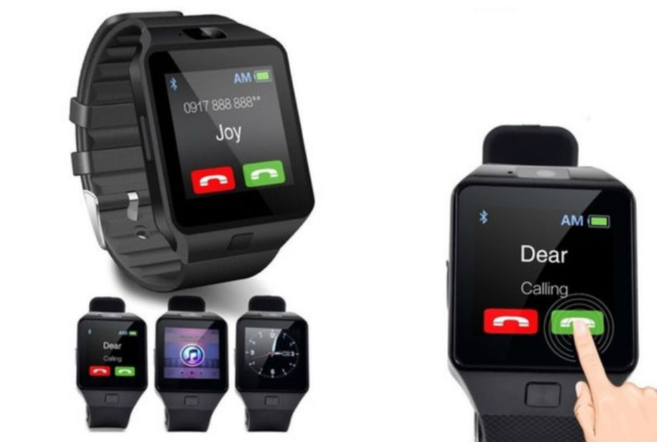
Watch out Apple because there is a newer, much bigger watch in town. This one is so big you can fit your whole hand on its screen to call someone. Is it meant to be a wristwatch, or is it a belt? The only way to find out is to buy one.
'If You Were in a Car, Would You Know What Accident to do?'
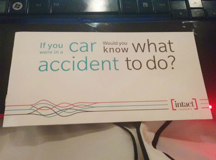
This is a classic example of how not to organize letters. Color is not going to draw your eyes to read in order. Usually, people read from left to right, then top to bottom. But why not confuse people when talking about car accidents?
Oh, Sweet Baby JESUS?!
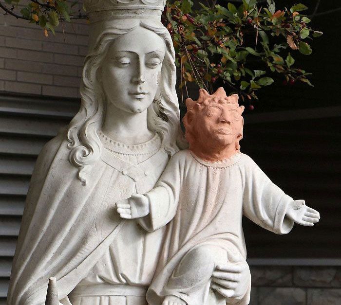
The head of the Jesus baby fell off this statue and they decided to replace it with a demon Satan-looking head instead… Thanks nightmare fuel!
'Are You Left Handed or Right Handed?'
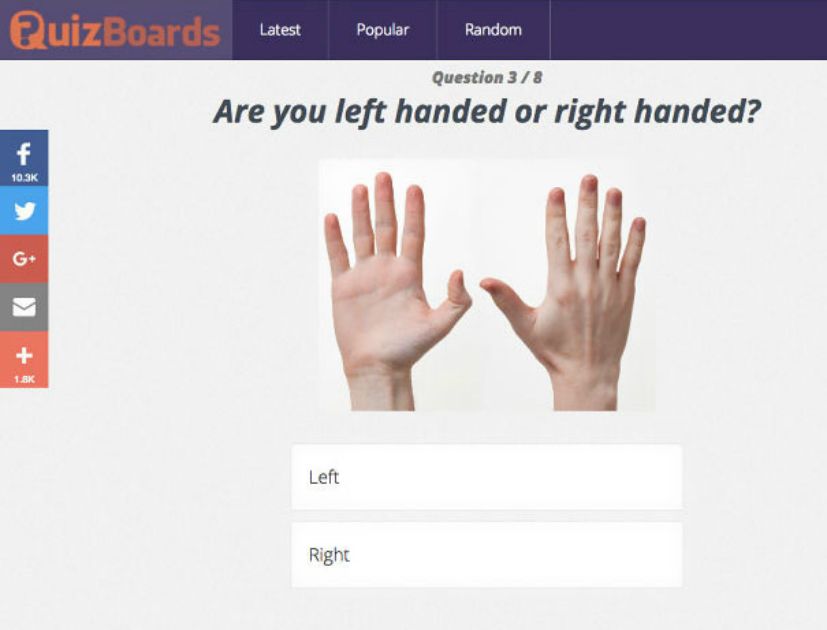
This image may seem normal at first glance, but look closer- Both hands are right hands. Was it really too difficult to find a picture of a left hand? Did no one look this over, say, by testing it out on their own hands?
What...What Happened Here?
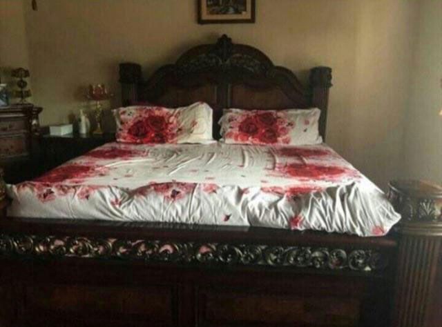
At first glance, yes this looks like the scene of a double homicide. Then you realize the bed spread is supposed to be red roses and you just have to wonder why nobody stopped this monstrosity from coming to light at the factory.
Love, Morriage, Boby
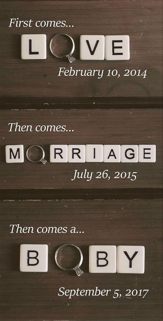
This could have been an adorable baby announcement, but instead it’s a hilarious lesson that a wedding ring can only ever be an “O.” Unless, of course, this couple is not having a baby and is indeed having a boby.
Really Crappy Design
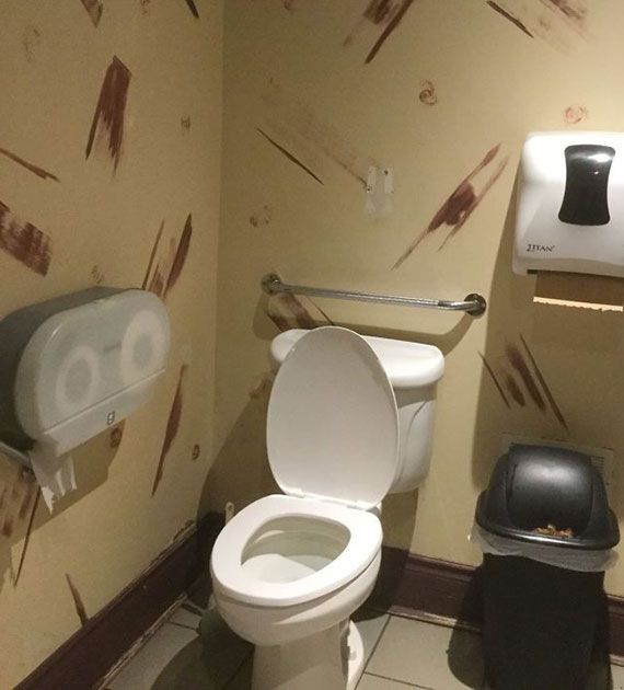
This wallpaper looks like it’s straight out of the 1990s, but with literal streaks of a 70s color palette. For those who remember, 90s fashion isn’t something to be fondly remembered. To make this all the worse, they used wallpaper with brown streaks for their bathroom… Listen, if you can’t tell what streaks are supposed to be there and which ones might be human leftovers, then you’re gonna have issues.
'Aaris'
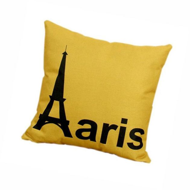
Another example of using objects instead of the letter, any souvenir from Paris will use the Eiffel Tower for the “A.” But this pillow, which is already unforgivably bland, can’t even do that right.
'Sasa Lele'
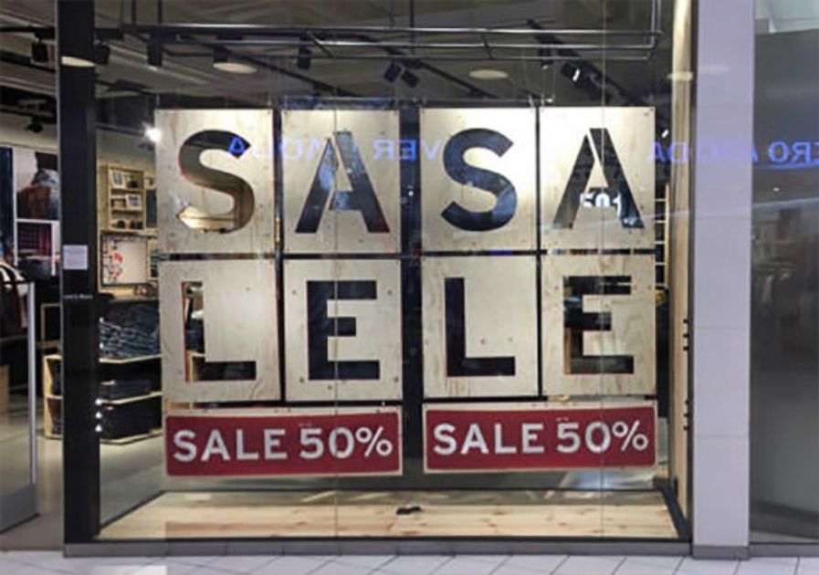
Once again, people are taught to read English top to bottom, so why not keep a good thing going? Even though it’s ridiculous, it certainly is eye-catching.
A Well-Designed Textbook
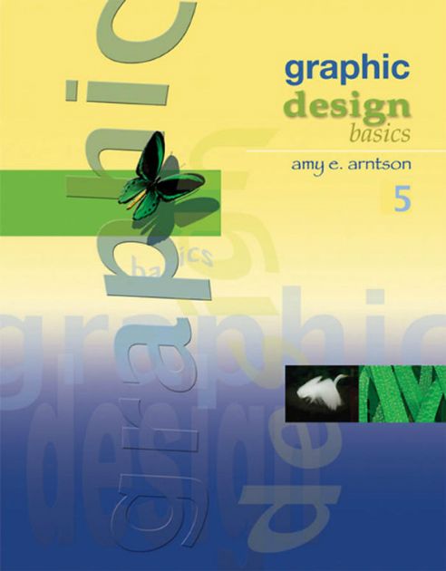
Clearly, whoever designed this graphic design textbook did not read a single page of it. Instead, they must have read a manual on Microsoft WordArt from the early 2000s.
Keep Your Eyes on the Road
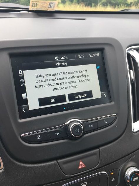
This sign has good intentions, but imagine reading it on the road. You’d have to be the only one on the highway not to crash. Why not have a sign that reads, “Eyes on the road!” instead?
An Unfortunate Bowling Alley
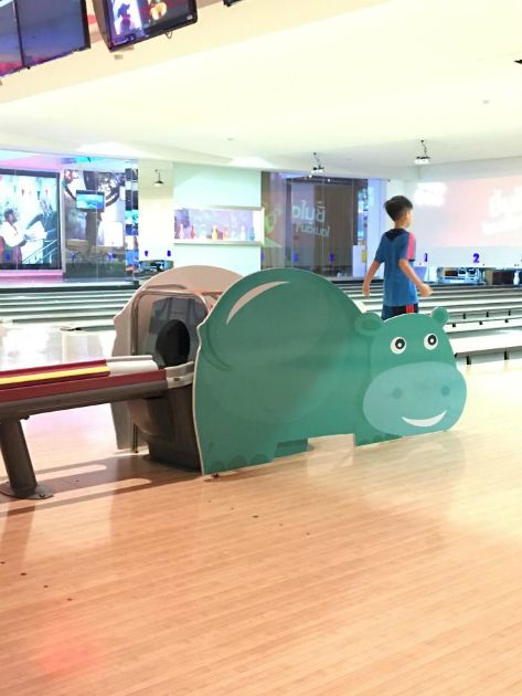
This hippo’s placement is so unbelievable that it looks like an elaborate prank. It’s even smiling. We’d hate to see what it looks like when a bowling ball rolls out.
'Hannah Montan'
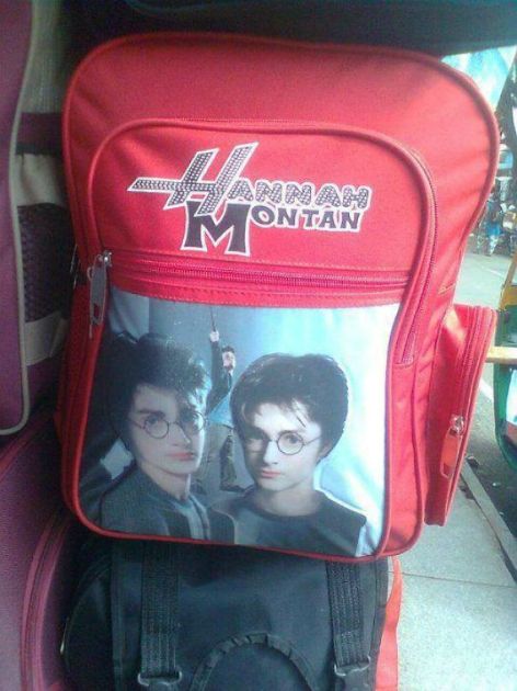
It’s hard to know where to begin with this backpack. The misspelled “Hannah Montana” or the wrong character printed on it? No; we think the worst thing here is the way the three Harry Potters are sandwiched together.
These Bottles Are Too Similar
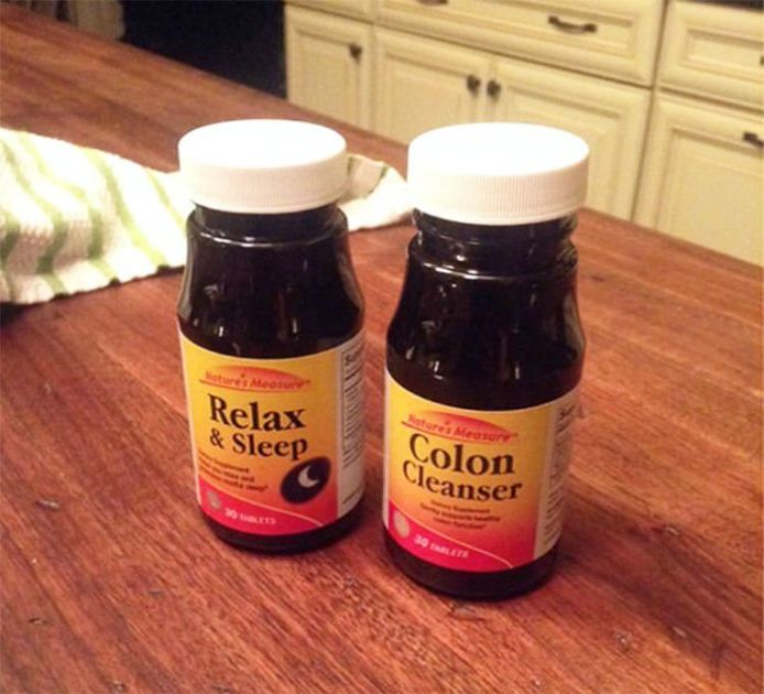
Imagine it’s late at night and you can’t sleep. You wander into the bathroom, open the medicine cabinet, and pop a few colon cleanser pills. That should make for a relaxing sleep.
A Terrible Choice of Marble
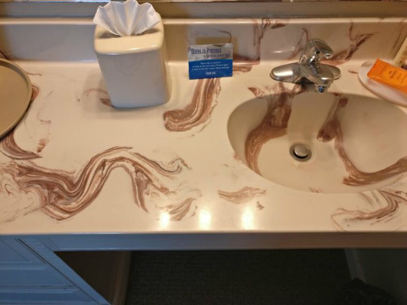
If this bathroom didn’t have a poorly chosen color scheme, it might even look acceptable. But washing your hands here would not be a fun experience at all.
Safety First
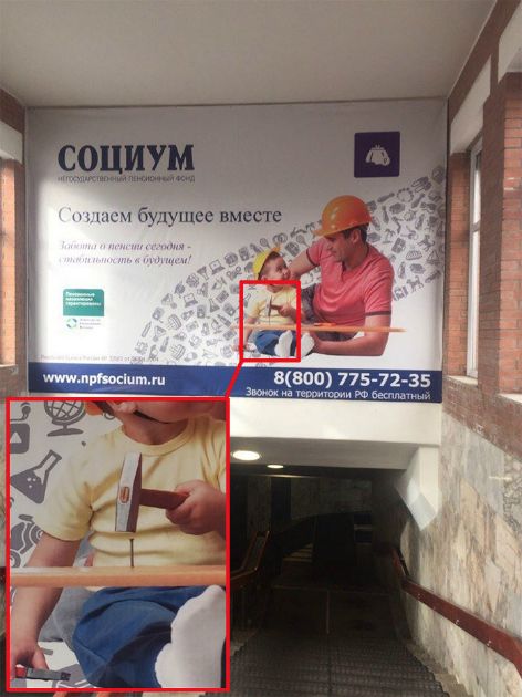
The worst part about this picture is not that this toddler is about to impale himself. He’s using the wrong kind of hammer. What he needs is a framing hammer. At least he’s wearing a hardhat.
'Could Not Connect to Translator Service'
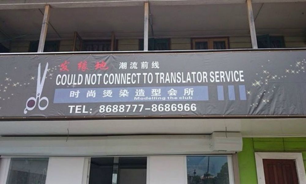
It always pays to double-check. We live in the internet age, where almost any language can be translated, albeit with a few grammatical mistakes. But why put up a sign in English when clearly no one in the area knows enough to spot the mistake?
'We Are the Borg. Resistance Is Futile'
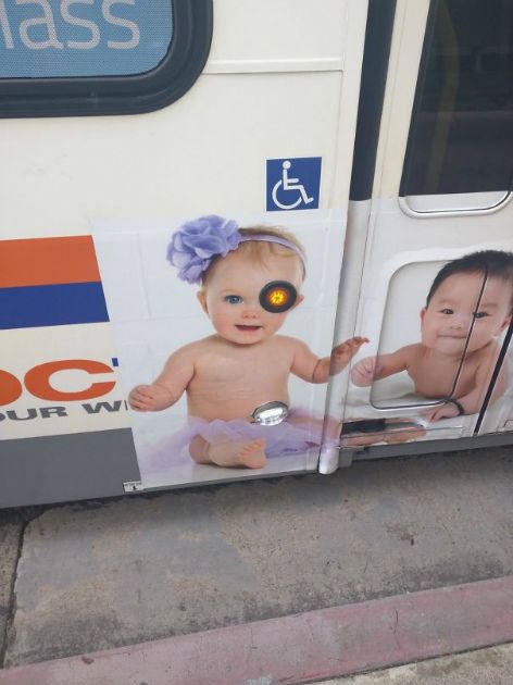
When putting a picture of a cute baby on a bus, be sure not to cut out its eyeball where an orange light needs to be. You’ll have a cyborg baby on your bus, and no one wants one of those.
'Disabled, Elderly, Pregnant Children'
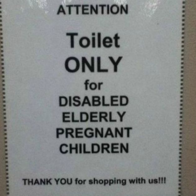
We know they’re talking about anyone who’s disabled, elderly, pregnant, or a child, but why not add a few commas and the wonderful word, “or?”
'Window Signs Made Here'
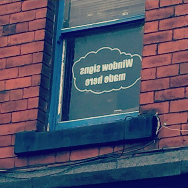
This may look woefully stupid at first glance, but remember that these sign installers are experts. They do this for a living. From the inside, it must look fantastic.
Allison: A Name Above Jesus
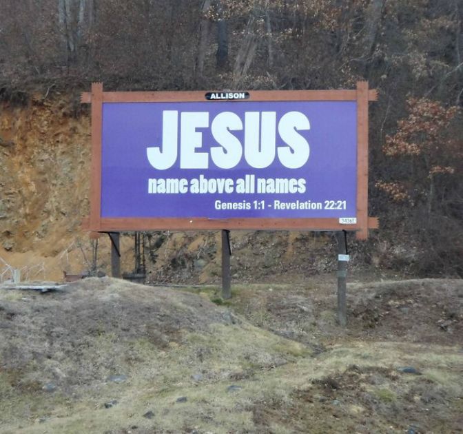
This sign looks good. Everything is spelled right, the letters are clear, the font is not atrocious, but look closer. Is Jesus really a name above all names?
Buckle Up
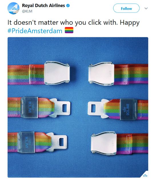
While the ad is very elegant and the sentiment is positive and inclusive, it won’t work when it’s time for takeoff. There must be a better way to communicate such a good message without this obvious flaw.
What's Your Number?
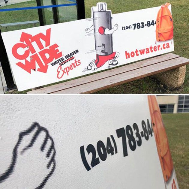
At first glance, it looks like someone mistakenly left their orange backpack on the corner of the bench. If you need to see the number, just remove the bag. Unfortunately, the designers actually put the backpack stock image over the number, so it’s impossible to see the number to call their business. Whoops!
Yum?
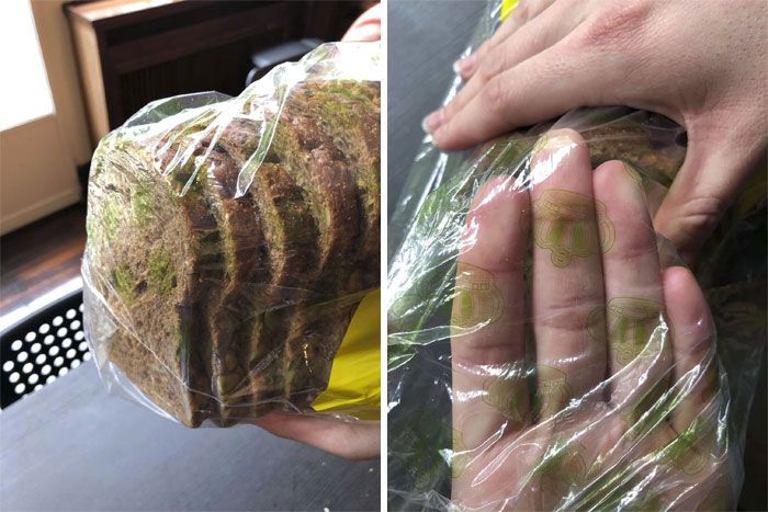
These bread bags have their nice logo printed all over the bags. Unfortunately, when the bread is in the actual bag, it makes it look like the bread is moldy. Did nobody think at the bag factory that a green logo could be problematic??
Actually, Please Wake Me Up
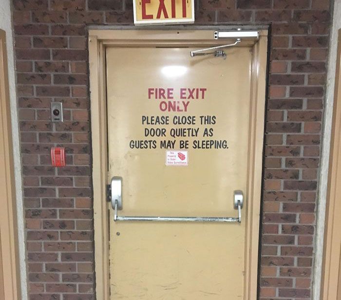
Ummm, if there’s an actual fire, I would want this door opening and closing as loudly as possible, please. In fact, please be screaming bloody-murder as you’re exiting. Thanks!
Delicious?
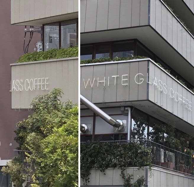
Whoever designed this sign, clearly didn’t bother to review the sign from all angles. We’re not even sure why the sign bends around the corner to begin with! We can definitely do without some a** coffee today, thanks very much.
Glow in the Dark
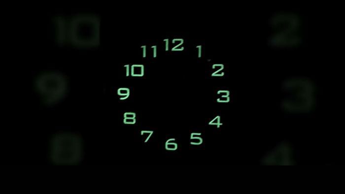
This wonderful glow-in-the-dark clock is great if you need to see the clock at night. It’s just not so great if you need to tell the time since the hands do not actually light up.
Hope You're Not a Light Sleeper
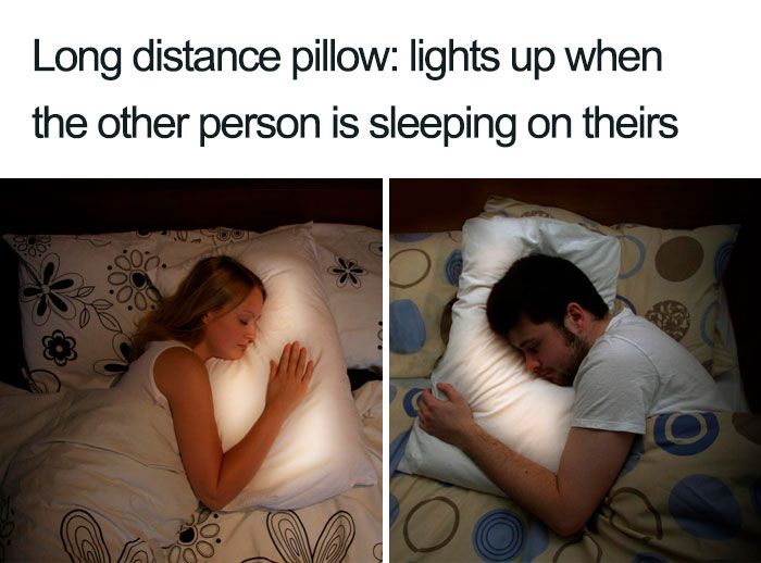
Evidently, this pillow lights up when your long-distance relationship partner is using theirs. The problem is that if you actually use the pillow to sleep, you’ll have to sleep through the bright lights. How did these geniuses not see a problem with that at the pillow brainstorming session?!
Marbled Steak?

If this looks like a nice spread of cubed marbled steak ready to go on the grill, you’d be wrong. It’s actually a pink, crystalized patio set. So, if you’re going for that chic cannibal design aesthetic, this is the patio set for you.
Just a Sample
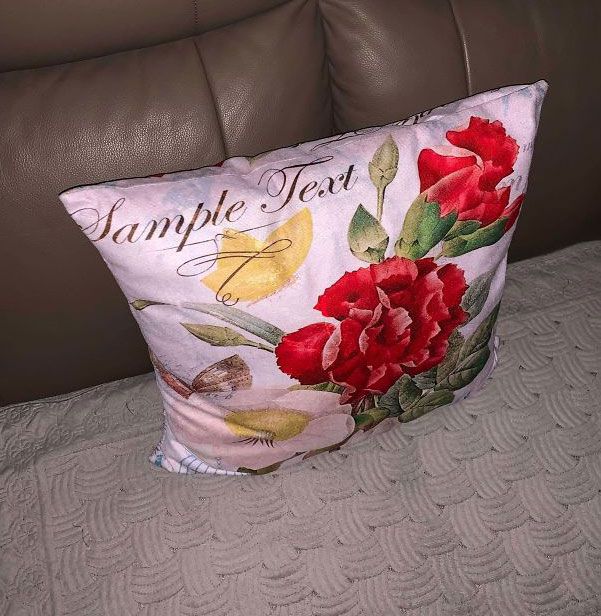
When you try to buy something nice for the house and didn’t realize that the “Sample Text” space needed to be deleted before you completed your order, this is what you get.
Designed to Never Clean
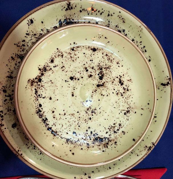
The great thing about these dishes is that you’ll never actually be able to tell if they’re clean or dirty, so you can basically not bother washing them and save yourself loads of time! It’s a win-win, right?
Ran Out of Models?
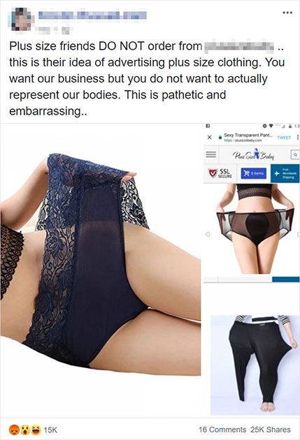
The social media caption for this image pretty much explains it all- The company is promoting their “plus-size” clothing by not actually featuring any plus-size models wearing it. The image of the skinny woman standing in one pant leg is the real kicker here.
I'm Good, Thanks...
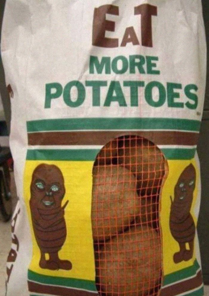
If you want somebody to “Eat More Potatoes,” please don’t design the most terrifying potato-E.T. the Extra-Terrestrial mashup imaginable. It makes me want to phone home for my gun and shoot the thing.
How Do You People Not See the Problem Here?
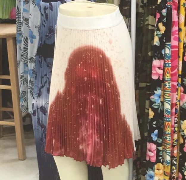
Again, red dye on any fabric is going to problematic if it’s only splattered on. If it’s a completely red skirt, no problem! But when it looks like it’s pouring out the crotch, then you’re just asking for trouble wearing this.
Why Though?
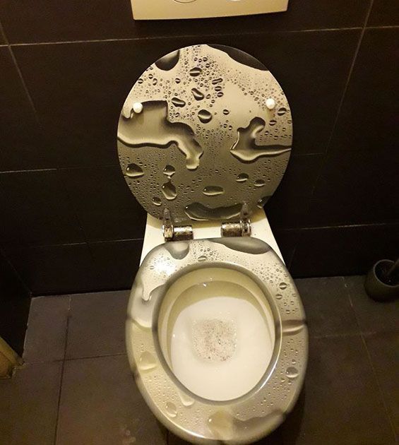
If you’re hoping this design masks that fact that you can’t pee in the toilet bowl, then you have more serious issues to resolve than your bathroom décor choices. Like, why would you even want it to look like that?!

Quick Links